python常用可视化技巧
我们在对数据进行预处理时,常常需要对数据做一些可视化的工作,以便能更清晰的认识数据内部的规律。
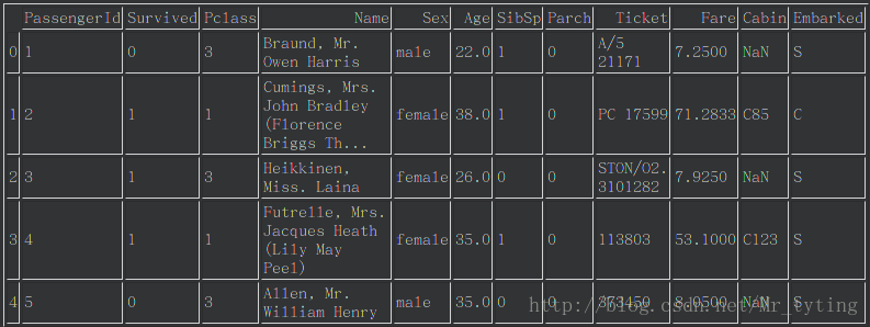
这里我们以kaggle案例泰坦尼克问题的数据做一些常用的可视化的工作。首先看下这个数据集:
import pandas as pd
import numpy as np
import matplotlib.pyplot as plt
import matplotlib
sorted([f.name for f in matplotlib.font_manager.fontManager.ttflist])
data_train=pd.read_csv('train.csv')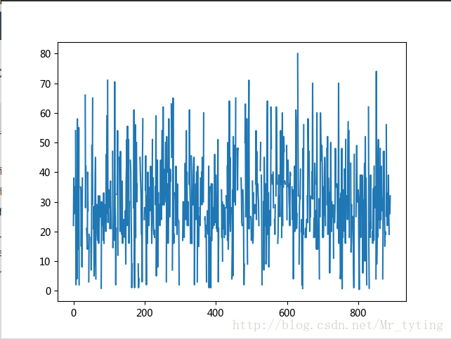
plt.plot(data_train.Age)- 1
- 2
- 3
- 4
- 5
- 6
- 7
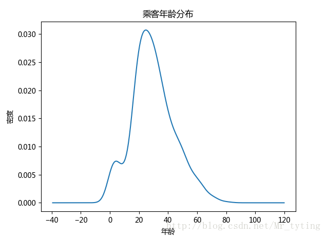
##现在我们想看看乘客年龄分布,kde就是密度分布,类似于直方图,数据落在在每个bin内的频率大小或者是密度大小
data_train.Age.plot(kind='kde')
plt.xlabel(u"年龄")# plots an axis lable
plt.ylabel(u"密度")
plt.title(u"乘客年龄分布")- 1
- 2
- 3
- 4
- 5
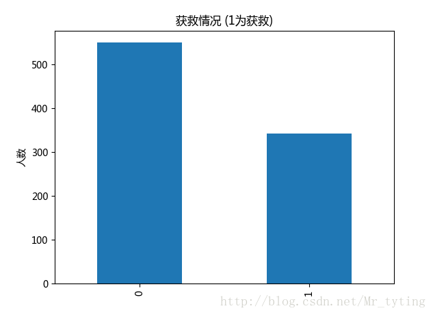
##现在看看获救人数和未获救人数对比
#plt.subplot2grid((2,3),(0,0))
data_train.Survived.value_counts().plot(kind='bar')# plots a bar graph of those who surived vs those who did not.
plt.title(u"获救情况 (1为获救)") # puts a title on our graph
plt.ylabel(u"人数")- 1
- 2
- 3
- 4
- 5
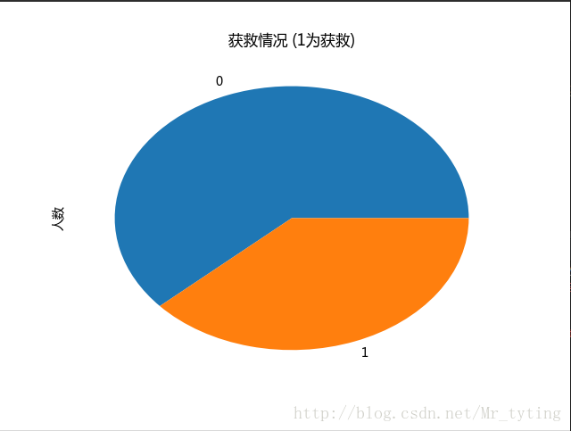
##也可以以饼状图看看获救人数和未获救人数对比
#plt.subplot2grid((2,3),(0,0))
data_train.Survived.value_counts().plot(kind='pie')# plots a bar graph of those who surived vs those who did not.
plt.title(u"获救情况 (1为获救)") # puts a title on our graph
plt.ylabel(u"人数")- 1
- 2
- 3
- 4
- 5
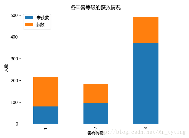
## 常看各乘客等级的获救情况
Survived_0 = data_train.Pclass[data_train.Survived == 0].value_counts()
Survived_1 = data_train.Pclass[data_train.Survived == 1].value_counts()
df=pd.DataFrame({u'获救':Survived_1, u'未获救':Survived_0})
df.plot(kind='bar', stacked=True)
plt.title(u"各乘客等级的获救情况")
plt.xlabel(u"乘客等级")
plt.ylabel(u"人数")- 1
- 2
- 3
- 4
- 5
- 6
- 7
- 8
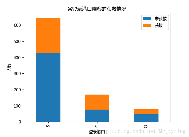
##查看各登录港口获救情况
Survived_0 = data_train.Embarked[data_train.Survived == 0].value_counts()
Survived_1 = data_train.Embarked[data_train.Survived == 1].value_counts()
df=pd.DataFrame({u'获救':Survived_1, u'未获救':Survived_0})
df.plot(kind='bar', stacked=True)
plt.title(u"各登录港口乘客的获救情况")
plt.xlabel(u"登录港口")
plt.ylabel(u"人数") - 1
- 2
- 3
- 4
- 5
- 6
- 7
- 8
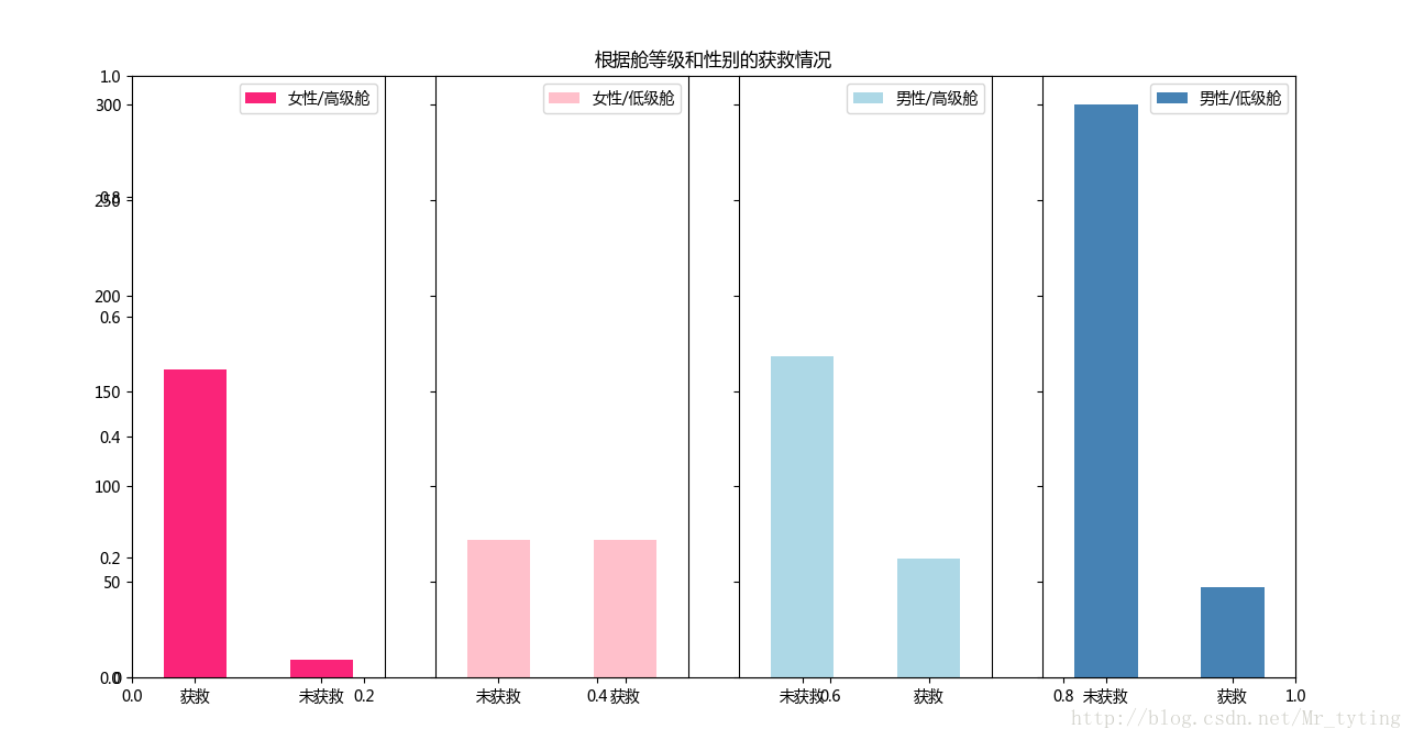
##再来看看各种级别舱情况下性别的获救情况
fig=plt.figure()
fig.set(alpha=0.65) # 设置图像透明度,无所谓
plt.title(u"根据舱等级和性别的获救情况")ax1=fig.add_subplot(141)
data_train.Survived[data_train.Sex == 'female'][data_train.Pclass != 3].value_counts().plot(kind='bar', label="female highclass", color='#FA2479')
ax1.set_xticklabels([u"获救", u"未获救"], rotation=0)
ax1.legend([u"女性/高级舱"], loc='best')ax2=fig.add_subplot(142, sharey=ax1)
data_train.Survived[data_train.Sex == 'female'][data_train.Pclass == 3].value_counts().plot(kind='bar', label='female, low class', color='pink')
ax2.set_xticklabels([u"未获救", u"获救"], rotation=0)
plt.legend([u"女性/低级舱"], loc='best')ax3=fig.add_subplot(143, sharey=ax1)
data_train.Survived[data_train.Sex == 'male'][data_train.Pclass != 3].value_counts().plot(kind='bar', label='male, high class',color='lightblue')
ax3.set_xticklabels([u"未获救", u"获救"], rotation=0)
plt.legend([u"男性/高级舱"], loc='best')ax4=fig.add_subplot(144, sharey=ax1)
data_train.Survived[data_train.Sex == 'male'][data_train.Pclass == 3].value_counts().plot(kind='bar', label='male low class', color='steelblue')
ax4.set_xticklabels([u"未获救", u"获救"], rotation=0)
plt.legend([u"男性/低级舱"], loc='best')- 1
- 2
- 3
- 4
- 5
- 6
- 7
- 8
- 9
- 10
- 11
- 12
- 13
- 14
- 15
- 16
- 17
- 18
- 19
- 20
- 21
- 22
- 23
- 24
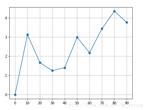
import pandas as pd
import numpy as np
import matplotlib.pyplot as pltfig=plt.figure()
ax=fig.add_subplot(1,1,1)
ax.plot(np.arange(0,100,10),np.random.randn(10).cumsum(),marker='o')
ax.set_xticks([0,10,20,30,40,50,60,70,80,90]) ##设置x轴上显示的刻度
ax.grid()## 显示方格
plt.show()- 1
- 2
- 3
- 4
- 5
- 6
- 7
- 8
- 9
- 10
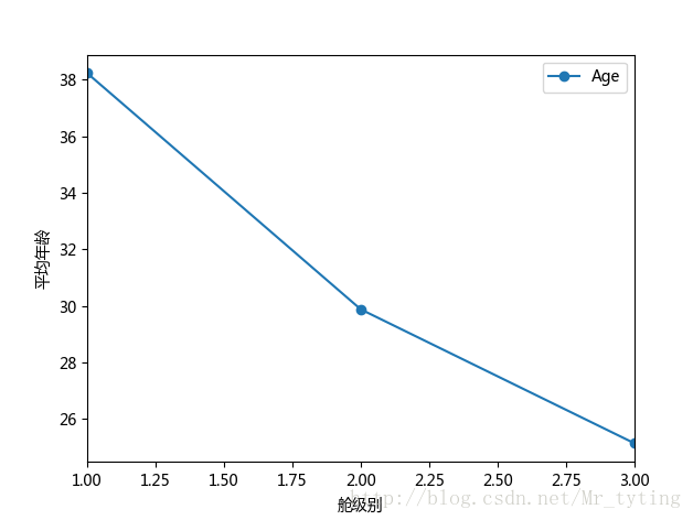
##现在我们想看看每个等级的舱的乘客的平均年龄
data_train.groupby('Pclass').mean().plot(y='Age',marker='o')
##注意参数marker='o'强调实际的数据点,会在实际的数据点上加一个实心点。如果要显示方格可在plot里面设置参数grid=True
plt.xlabel(u"舱级别")
plt.ylabel(u"平均年龄")- 1
- 2
- 3
- 4
- 5
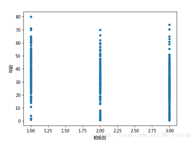
##也可以这样看看年龄和所在舱级别的关系
data_train.plot(x='Pclass',y='Age',kind='scatter')
plt.xlabel(u"舱级别")
plt.ylabel(u"年龄")
plt.show()- 1
- 2
- 3
- 4
- 5
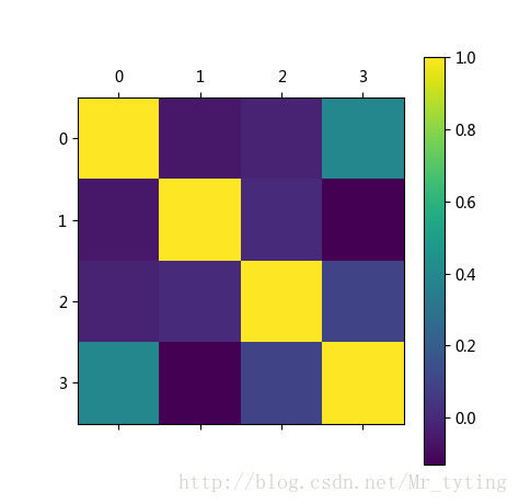
我们换一个连续性变量多的数据集,看看特征直接相关度。
corr = df_train_origin[['temp','weather','windspeed','day', 'month', 'hour','count']].corr()
# 用颜色深浅来表示相关度
plt.figure()
plt.matshow(corr)
plt.colorbar()
plt.show()- 1
- 2
- 3
- 4
- 5
- 6
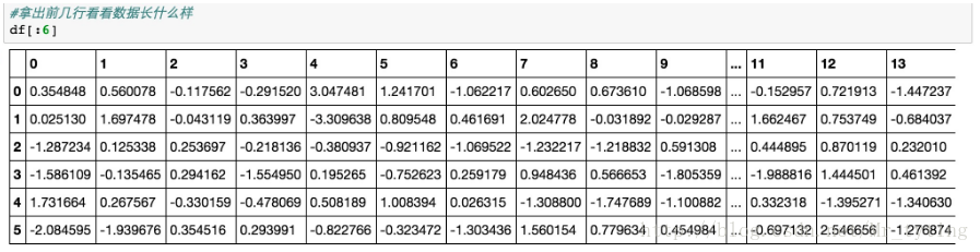
下面我们看看高维数据如何做可视化分析,首先咱们造个高维数据集
#numpy科学计算工具箱
import numpy as np
#使用make_classification构造1000个样本,每个样本有20个feature
from sklearn.datasets import make_classification
X, y = make_classification(1000, n_features=20, n_informative=2, n_redundant=2, n_classes=2, random_state=0)
#存为dataframe格式
from pandas import DataFrame
df = DataFrame(np.hstack((X, y[:, None])),columns = range(20) + ["class"])- 1
- 2
- 3
- 4
- 5
- 6
- 7
- 8
- 9
数据的可视化有很多工具包可以用,比如下面我们用来做数据可视化的工具包Seaborn。最简单的可视化就是数据散列分布图和柱状图,这个可以用Seanborn的pairplot来完成。以下图中2种颜色表示2种不同的类,因为20维的可视化没有办法在平面表示,我们取出了一部分维度,两两组成pair看数据在这2个维度平面上的分布状况,代码和结果如下:
#存为dataframe格式
from pandas import DataFrame
df = DataFrame(np.hstack((X, y[:, None])),columns = range(20) + ["class"])
import seaborn as sns
#使用pairplot去看不同特征维度pair下数据的空间分布状况
## vars表示把里面的特征两两做个可视化
_ = sns.pairplot(df[:50], vars=[8, 11, 12, 14, 19], hue="class", size=1.5)
plt.show()- 1
- 2
- 3
- 4
- 5
- 6
- 7
- 8
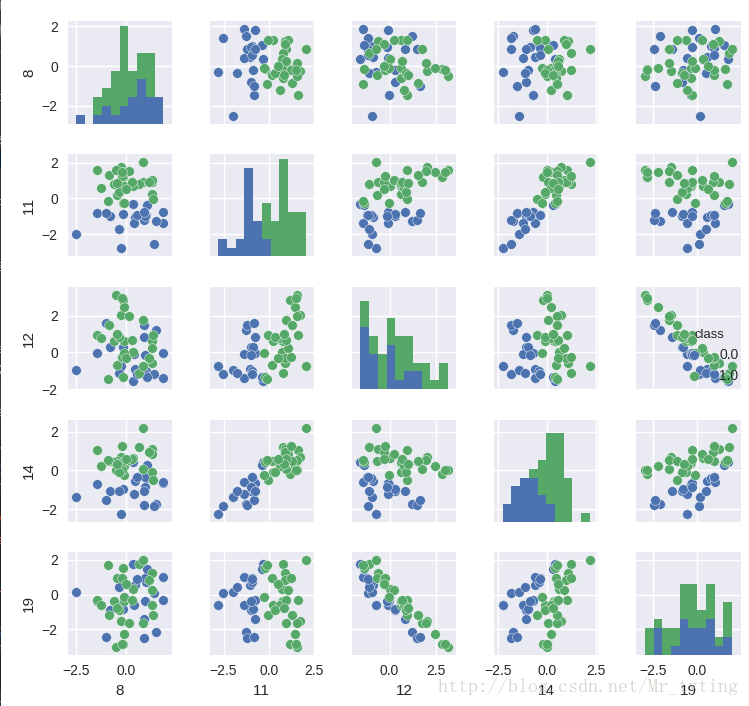
我们从散列图和柱状图上可以看出,确实有些维度的特征相对其他维度,有更好的区分度,比如第11维和14维看起来很有区分度。这两个维度上看,数据点是近似线性可分的。而12维和19维似乎呈现出了很高的负相关性。接下来我们用Seanborn中的corrplot来计算计算各维度特征之间(以及最后的类别)的相关性。代码和结果图如下:
import matplotlib.pyplot as plt
plt.figure(figsize=(12, 10))
_ = sns.linearmodels.corrplot(df, annot=False)
plt.show()- 1
- 2
- 3
- 4
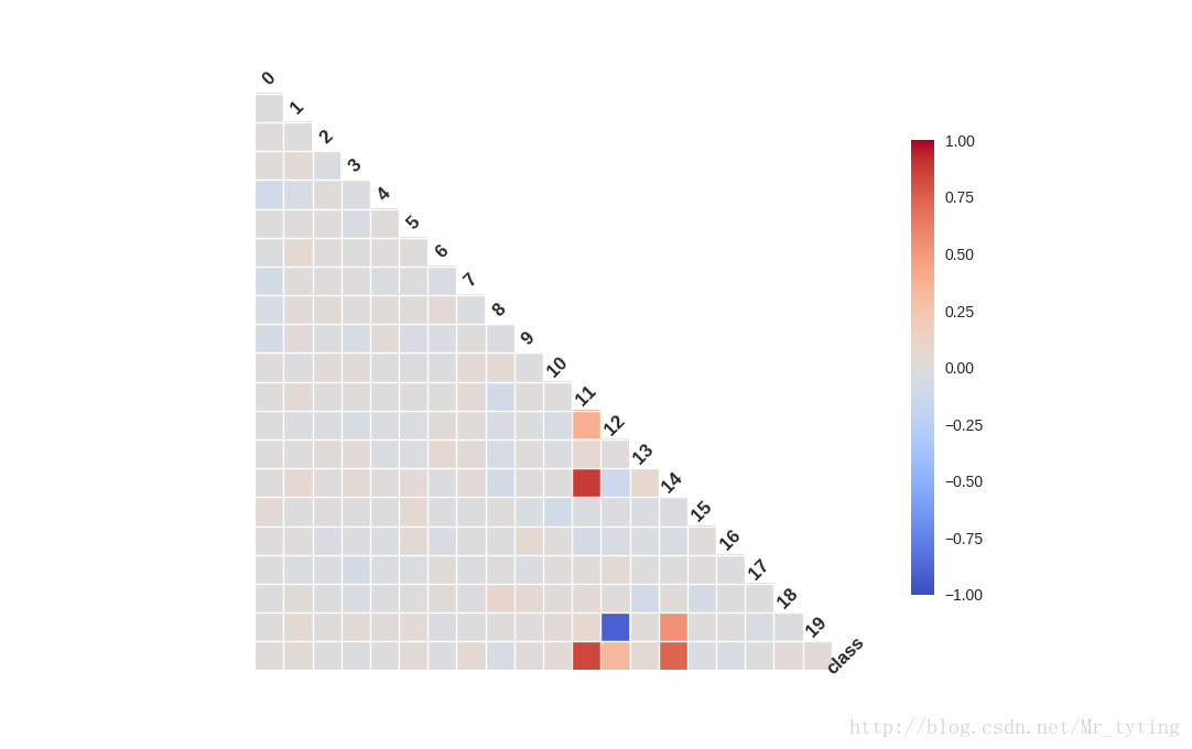
相关性图很好地印证了我们之前的想法,可以看到第11维特征和第14维特征和类别有极强的相关性,同时它们俩之间也有极高的相关性。而第12维特征和第19维特征却呈现出极强的负相关性。强相关的特征其实包含了一些冗余的特征,而除掉上图中颜色较深的特征,其余特征包含的信息量就没有这么大了,它们和最后的类别相关度不高,甚至各自之间也没什么先惯性。
新增部分
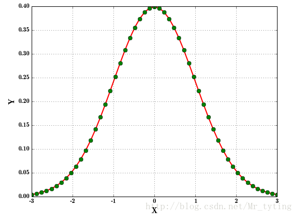
绘制正态分布概率密度函数代码如下
mu = 0##均值为0sigma = 1##方差为1x = np.linspace(mu - 3 * sigma, mu + 3 * sigma, 51)y = np.exp(-(x - mu) ** 2 / (2 * sigma ** 2)) / (math.sqrt(2 * math.pi) * sigma)print x.shapeprint 'x = \n', xprint y.shapeprint 'y = \n', y# plt.plot(x, y, 'ro-', linewidth=2)plt.figure(facecolor='w') ## 背景颜色取白色## 'r-':表示实线绘制,然后再画x,y,'go'表示用圆圈绘制,linewidth=2表示实线宽度2,markersize=8表示圆圈大小为8plt.plot(x, y, 'r-', x, y, 'go', linewidth=2, markersize=8)plt.xlabel('X', fontsize=15)##横轴用X标记plt.ylabel('Y', fontsize=15)##plt.title(u'高斯分布函数', fontsize=18)plt.grid(True)##画出虚线方格plt.show()- 1
- 2
- 3
- 4
- 5
- 6
- 7
- 8
- 9
- 10
- 11
- 12
- 13
- 14
- 15
- 16
- 17
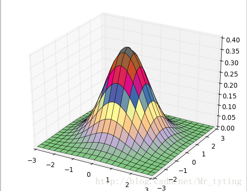
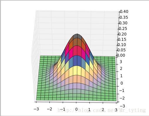
我们可以绘制在三维空间的正态分布图代码如下
#!/usr/bin/python
# -*- coding:utf-8 -*-import numpy as np
from mpl_toolkits.mplot3d import Axes3D
from matplotlib import cm
import matplotlib.pyplot as plt
import mathx, y = np.mgrid[-3:3:100j, -3:3:100j]## 横轴,纵轴都在[-3,3)内取一百个点
# u = np.linspace(-3, 3, 101)
# x, y = np.meshgrid(u, u)## 这两行的效果同上面一行代码效果相同
z = np.exp(-(x**2 + y**2)/2) / math.sqrt(2*math.pi)## 三维正太分布
# z = x*y*np.exp(-(x**2 + y**2)/2) / math.sqrt(2*math.pi)
fig = plt.figure()
ax = fig.add_subplot(111, projection='3d')
ax.plot_surface(x, y, z, rstride=5, cstride=5, cmap=cm.coolwarm, linewidth=0.1)
#ax.plot_surface(x, y, z, rstride=3, cstride=3, cmap=cm.Accent, linewidth=0.5) ## 参数rstride,cstride表示每几个取一个点,越小越密集
plt.show()- 1
- 2
- 3
- 4
- 5
- 6
- 7
- 8
- 9
- 10
- 11
- 12
- 13
- 14
- 15
- 16
- 17
- 18
- 19
- 20
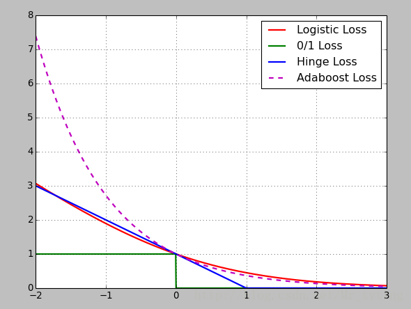
损失函数:Logistic损失(-1,1)/SVM Hinge损失/ 0/1损失
x = np.array(np.linspace(start=-2, stop=3, num=1001, dtype=np.float))y_logit = np.log(1 + np.exp(-x)) / math.log(2)y_boost = np.exp(-x)y_01 = x < 0y_hinge = 1.0 - xy_hinge[y_hinge < 0] = 0plt.figsize(figsize=(5,7),facecolor='w')##设置大小和背景颜色## 我们下面绘制的四幅图都是用的上面同一个plt,故下面四条线都在一张图中显示,如果想在不同图中显示,只需要在plt.plot之前重新定义一个figsize即可。plt.plot(x, y_logit, 'r-', label='Logistic Loss', linewidth=2)plt.plot(x, y_01, 'g-', label='0/1 Loss', linewidth=2)plt.plot(x, y_hinge, 'b-', label='Hinge Loss', linewidth=2)plt.plot(x, y_boost, 'm--', label='Adaboost Loss', linewidth=2) ## 'm--',1其中m表示颜色,--表示虚线,label表示图例中这条线的名称,linewidth线的宽度plt.grid()plt.legend(loc='upper right') ## 图例的位置# plt.savefig('1.png')plt.show()- 1
- 2
- 3
- 4
- 5
- 6
- 7
- 8
- 9
- 10
- 11
- 12
- 13
- 14
- 15
- 16
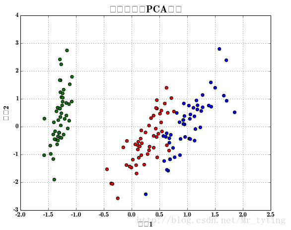
画散点图:
# -*- coding:utf-8 -*-import pandas as pd
import numpy as np
from sklearn.decomposition import PCA
from sklearn.linear_model import LogisticRegressionCV
from sklearn import metrics
from sklearn.model_selection import train_test_split
import matplotlib as mpl
import matplotlib.pyplot as plt
import matplotlib.patches as mpatches
from sklearn.pipeline import Pipeline
from sklearn.preprocessing import PolynomialFeaturesdef extend(a, b):return 1.05*a-0.05*b, 1.05*b-0.05*aif __name__ == '__main__':pd.set_option('display.width', 200)data = pd.read_csv('iris.data', header=None)columns = ['sepal_length', 'sepal_width', 'petal_length', 'petal_width', 'type']data.rename(columns=dict(zip(np.arange(5), columns)), inplace=True)data['type'] = pd.Categorical(data['type']).codesprint data.head(5)x = data.loc[:, columns[:-1]]y = data['type']pca = PCA(n_components=2, whiten=True, random_state=0)x = pca.fit_transform(x)print '各方向方差:', pca.explained_variance_print '方差所占比例:', pca.explained_variance_ratio_print x[:5]cm_light = mpl.colors.ListedColormap(['#77E0A0', '#FF8080', '#A0A0FF'])cm_dark = mpl.colors.ListedColormap(['g', 'r', 'b'])mpl.rcParams['font.sans-serif'] = u'SimHei'mpl.rcParams['axes.unicode_minus'] = Falseplt.figure(facecolor='w')plt.scatter(x[:, 0], x[:, 1], s=30, c=y, marker='o', cmap=cm_dark)#s表示散点圆圈缩放大小,c表示类别,marker表示标记为圆圈,cmp表示不同类的对比颜色plt.grid(b=True, ls=':')plt.xlabel(u'组份1', fontsize=14)plt.ylabel(u'组份2', fontsize=14)plt.title(u'鸢尾花数据PCA降维', fontsize=18)# plt.savefig('1.png')plt.show()- 1
- 2
- 3
- 4
- 5
- 6
- 7
- 8
- 9
- 10
- 11
- 12
- 13
- 14
- 15
- 16
- 17
- 18
- 19
- 20
- 21
- 22
- 23
- 24
- 25
- 26
- 27
- 28
- 29
- 30
- 31
- 32
- 33
- 34
- 35
- 36
- 37
- 38
- 39
- 40
- 41
- 42
- 43
- 44
- 45
- 46
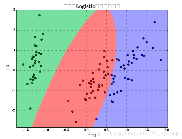
接着上面画出逻辑回归的分类效果图:
x, x_test, y, y_test = train_test_split(x, y, train_size=0.7)model = Pipeline([('poly', PolynomialFeatures(degree=2, include_bias=True)),('lr', LogisticRegressionCV(Cs=np.logspace(-3, 4, 8), cv=5, fit_intercept=False))])model.fit(x, y)print '最优参数:', model.get_params('lr')['lr'].C_y_hat = model.predict(x)print '训练集精确度:', metrics.accuracy_score(y, y_hat)y_test_hat = model.predict(x_test)print '测试集精确度:', metrics.accuracy_score(y_test, y_test_hat)N, M = 500, 500 # 横纵各采样多少个值x1_min, x1_max = extend(x[:, 0].min(), x[:, 0].max()) # 第0列的范围x2_min, x2_max = extend(x[:, 1].min(), x[:, 1].max()) # 第1列的范围t1 = np.linspace(x1_min, x1_max, N)t2 = np.linspace(x2_min, x2_max, M)x1, x2 = np.meshgrid(t1, t2) # 生成网格采样点x_show = np.stack((x1.flat, x2.flat), axis=1) # 测试点y_hat = model.predict(x_show) # 预测值y_hat = y_hat.reshape(x1.shape) # 使之与输入的形状相同plt.figure(facecolor='w')plt.pcolormesh(x1, x2, y_hat, cmap=cm_light) # 预测值的显示plt.scatter(x[:, 0], x[:, 1], s=30, c=y, edgecolors='k', cmap=cm_dark) # 样本的显示plt.xlabel(u'组份1', fontsize=14)plt.ylabel(u'组份2', fontsize=14)plt.xlim(x1_min, x1_max)plt.ylim(x2_min, x2_max)plt.grid(b=True, ls=':')## 不同类的区域显示不同的颜色patchs = [mpatches.Patch(color='#77E0A0', label='Iris-setosa'),mpatches.Patch(color='#FF8080', label='Iris-versicolor'),mpatches.Patch(color='#A0A0FF', label='Iris-virginica')]plt.legend(handles=patchs, fancybox=True, framealpha=0.8, loc='lower right')plt.title(u'鸢尾花Logistic回归分类效果', fontsize=17)plt.show()- 1
- 2
- 3
- 4
- 5
- 6
- 7
- 8
- 9
- 10
- 11
- 12
- 13
- 14
- 15
- 16
- 17
- 18
- 19
- 20
- 21
- 22
- 23
- 24
- 25
- 26
- 27
- 28
- 29
- 30
- 31
- 32
- 33
- 34
- 35
- 36
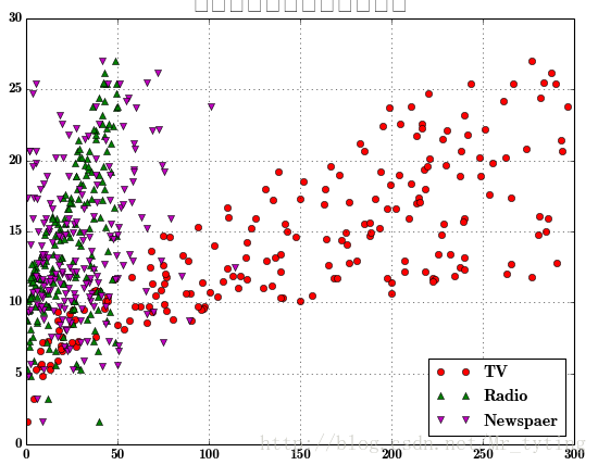
利用matplot.pyplot.plot画出某个特征或者某些特征与对应的类别标签的关系
plt.figure(facecolor='w')plt.plot(data['TV'], y, 'ro', label='TV')plt.plot(data['Radio'], y, 'g^', label='Radio')plt.plot(data['Newspaper'], y, 'mv', label='Newspaer')plt.legend(loc='lower right')plt.xlabel(u'广告花费', fontsize=16)plt.ylabel(u'销售额', fontsize=16)plt.title(u'广告花费与销售额对比数据', fontsize=20)plt.grid()plt.show()- 1
- 2
- 3
- 4
- 5
- 6
- 7
- 8
- 9
- 10
这里总结下plot函数里面的形状参数:’ro’:表示红色圆圈,’g^’:蓝色上三角,前一个字母表示颜色,后一个字符表示形状。可用的形状有’^’,’V’,’‘,’>’,’<’,’:’,’-‘,’–’等。*
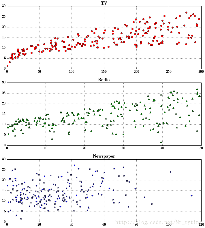
把上面三个图分开来画,凸显每个特征与类别的关系
plt.figure(facecolor='w', figsize=(9, 10))plt.subplot(311) ##这个plt画出的图,分有3个位置,3行1列,占第一个位置plt.plot(data['TV'], y, 'ro') plt.title('TV')plt.grid()plt.subplot(312)##占第二个位置plt.plot(data['Radio'], y, 'g^')plt.title('Radio')plt.grid()plt.subplot(313)## 占第三个位置plt.plot(data['Newspaper'], y, 'b*')plt.title('Newspaper')plt.grid()plt.tight_layout()plt.show()- 1
- 2
- 3
- 4
- 5
- 6
- 7
- 8
- 9
- 10
- 11
- 12
- 13
- 14
- 15
Python--matplotlib绘图可视化知识点整理
本文作为学习过程中对matplotlib一些常用知识点的整理,方便查找。
强烈推荐ipython
无论你工作在什么项目上,IPython都是值得推荐的。利用ipython --pylab,可以进入PyLab模式,已经导入了matplotlib库与相关软件包(例如Numpy和Scipy),额可以直接使用相关库的功能。
这样IPython配置为使用你所指定的matplotlib GUI后端(TK/wxPython/PyQt/Mac OS X native/GTK)。对于大部分用户而言,默认的后端就已经够用了。Pylab模式还会向IPython引入一大堆模块和函数以提供一种更接近MATLAB的界面。
参考
-
matplotlib-绘制精美的图表
-
matplotlib.pyplot.plt参数介绍
- import matplotlib.pyplot as plt
- labels='frogs','hogs','dogs','logs'
- sizes=15,20,45,10
- colors='yellowgreen','gold','lightskyblue','lightcoral'
- explode=0,0.1,0,0
- plt.pie(sizes,explode=explode,labels=labels,colors=colors,autopct='%1.1f%%',shadow=True,startangle=50)
- plt.axis('equal')
- plt.show()
import matplotlib.pyplot as plt
labels='frogs','hogs','dogs','logs'
sizes=15,20,45,10
colors='yellowgreen','gold','lightskyblue','lightcoral'
explode=0,0.1,0,0
plt.pie(sizes,explode=explode,labels=labels,colors=colors,autopct='%1.1f%%',shadow=True,startangle=50)
plt.axis('equal')
plt.show()
matplotlib图标正常显示中文
为了在图表中能够显示中文和负号等,需要下面一段设置:
- import matplotlib mpl
- mpl.rcParams['font.sans-serif']=['SimHei'] #用来正常显示中文标签
- mpl.rcParams['axes.unicode_minus']=False #用来正常显示负号
import matplotlib mpl
mpl.rcParams['font.sans-serif']=['SimHei'] #用来正常显示中文标签
mpl.rcParams['axes.unicode_minus']=False #用来正常显示负号
matplotlib inline和pylab inline
可以使用ipython --pylab打开ipython命名窗口。
- %matplotlib inline #notebook模式下
- %pylab inline #ipython模式下
%matplotlib inline #notebook模式下
%pylab inline #ipython模式下
这两个命令都可以在绘图时,将图片内嵌在交互窗口,而不是弹出一个图片窗口,但是,有一个缺陷:除非将代码一次执行,否则,无法叠加绘图,因为在这两种模式下,是要有plt出现,图片会立马show出来,因此:
推荐在ipython notebook时使用,这样就能很方便的一次编辑完代码,绘图。
为项目设置matplotlib参数
在代码执行过程中,有两种方式更改参数:
-
使用参数字典(rcParams)
-
调用matplotlib.rc()命令 通过传入关键字元祖,修改参数
如果不想每次使用matplotlib时都在代码部分进行配置,可以修改matplotlib的文件参数。可以用matplot.get_config()命令来找到当前用户的配置文件目录。
配置文件包括以下配置项:
axex: 设置坐标轴边界和表面的颜色、坐标刻度值大小和网格的显示
backend: 设置目标暑促TkAgg和GTKAgg
figure: 控制dpi、边界颜色、图形大小、和子区( subplot)设置
font: 字体集(font family)、字体大小和样式设置
grid: 设置网格颜色和线性
legend: 设置图例和其中的文本的显示
line: 设置线条(颜色、线型、宽度等)和标记
patch: 是填充2D空间的图形对象,如多边形和圆。控制线宽、颜色和抗锯齿设置等。
savefig: 可以对保存的图形进行单独设置。例如,设置渲染的文件的背景为白色。
verbose: 设置matplotlib在执行期间信息输出,如silent、helpful、debug和debug-annoying。
xticks和yticks: 为x,y轴的主刻度和次刻度设置颜色、大小、方向,以及标签大小。
线条相关属性标记设置
用来该表线条的属性
| 线条风格linestyle或ls | 描述 | 线条风格linestyle或ls | 描述 | |
|---|---|---|---|---|
| '-' | 实线 | ':' | 虚线 | |
| '--' | 破折线 | 'None',' ','' | 什么都不画 | |
| '-.' | 点划线 | |||
线条标记
| 标记maker | 描述 | 标记 | 描述 | |
|---|---|---|---|---|
| 'o' | 圆圈 | '.' | 点 | |
| 'D' | 菱形 | 's' | 正方形 | |
| 'h' | 六边形1 | '*' | 星号 | |
| 'H' | 六边形2 | 'd' | 小菱形 | |
| '_' | 水平线 | 'v' | 一角朝下的三角形 | |
| '8' | 八边形 | '<' | 一角朝左的三角形 | |
| 'p' | 五边形 | '>' | 一角朝右的三角形 | |
| ',' | 像素 | '^' | 一角朝上的三角形 | |
| '+' | 加号 | '\ | ' | 竖线 |
| 'None','',' ' | 无 | 'x' | X | |
颜色
可以通过调用matplotlib.pyplot.colors()得到matplotlib支持的所有颜色。
| 别名 | 颜色 | 别名 | 颜色 | |
|---|---|---|---|---|
| b | 蓝色 | g | 绿色 | |
| r | 红色 | y | 黄色 | |
| c | 青色 | k | 黑色 | |
| m | 洋红色 | w | 白色 | |
如果这两种颜色不够用,还可以通过两种其他方式来定义颜色值:
-
使用HTML十六进制字符串
color='eeefff'使用合法的HTML颜色名字('red','chartreuse'等)。 -
也可以传入一个归一化到[0,1]的RGB元祖。
color=(0.3,0.3,0.4)
很多方法可以介绍颜色参数,如title()。
- plt.tilte('Title in a custom color',color='#123456')
plt.tilte('Title in a custom color',color='#123456')
背景色
通过向如matplotlib.pyplot.axes()或者matplotlib.pyplot.subplot()这样的方法提供一个axisbg参数,可以指定坐标这的背景色。
- subplot(111,axisbg=(0.1843,0.3098,0.3098)
subplot(111,axisbg=(0.1843,0.3098,0.3098)
基础
如果你向plot()指令提供了一维的数组或列表,那么matplotlib将默认它是一系列的y值,并自动为你生成x的值。默认的x向量从0开始并且具有和y同样的长度,因此x的数据是[0,1,2,3].
图片来自:绘图: matplotlib核心剖析
确定坐标范围
-
plt.axis([xmin, xmax, ymin, ymax])
上面例子里的axis()命令给定了坐标范围。 -
xlim(xmin, xmax)和ylim(ymin, ymax)来调整x,y坐标范围
- %matplotlib inline
- import numpy as np
- import matplotlib.pyplot as plt
- from pylab import *
- x = np.arange(-5.0, 5.0, 0.02)
- y1 = np.sin(x)
- plt.figure(1)
- plt.subplot(211)
- plt.plot(x, y1)
- plt.subplot(212)
- #设置x轴范围
- xlim(-2.5, 2.5)
- #设置y轴范围
- ylim(-1, 1)
- plt.plot(x, y1)
%matplotlib inline
import numpy as np
import matplotlib.pyplot as plt
from pylab import *
x = np.arange(-5.0, 5.0, 0.02)
y1 = np.sin(x)
plt.figure(1)
plt.subplot(211)
plt.plot(x, y1)
plt.subplot(212)
#设置x轴范围
xlim(-2.5, 2.5)
#设置y轴范围
ylim(-1, 1)
plt.plot(x, y1)
叠加图
用一条指令画多条不同格式的线。
- import numpy as np
- import matplotlib.pyplot as plt
- # evenly sampled time at 200ms intervals
- t = np.arange(0., 5., 0.2)
- # red dashes, blue squares and green triangles
- plt.plot(t, t, 'r--', t, t**2, 'bs', t, t**3, 'g^')
- plt.show()
import numpy as np
import matplotlib.pyplot as plt
# evenly sampled time at 200ms intervals
t = np.arange(0., 5., 0.2)
# red dashes, blue squares and green triangles
plt.plot(t, t, 'r--', t, t**2, 'bs', t, t**3, 'g^')
plt.show()
plt.figure()
你可以多次使用figure命令来产生多个图,其中,图片号按顺序增加。这里,要注意一个概念当前图和当前坐标。所有绘图操作仅对当前图和当前坐标有效。通常,你并不需要考虑这些事,下面的这个例子为大家演示这一细节。
- import matplotlib.pyplot as plt
- plt.figure(1) # 第一张图
- plt.subplot(211) # 第一张图中的第一张子图
- plt.plot([1,2,3])
- plt.subplot(212) # 第一张图中的第二张子图
- plt.plot([4,5,6])
- plt.figure(2) # 第二张图
- plt.plot([4,5,6]) # 默认创建子图subplot(111)
- plt.figure(1) # 切换到figure 1 ; 子图subplot(212)仍旧是当前图
- plt.subplot(211) # 令子图subplot(211)成为figure1的当前图
- plt.title('Easy as 1,2,3') # 添加subplot 211 的标题
import matplotlib.pyplot as plt
plt.figure(1) # 第一张图
plt.subplot(211) # 第一张图中的第一张子图
plt.plot([1,2,3])
plt.subplot(212) # 第一张图中的第二张子图
plt.plot([4,5,6])
plt.figure(2) # 第二张图
plt.plot([4,5,6]) # 默认创建子图subplot(111)
plt.figure(1) # 切换到figure 1 ; 子图subplot(212)仍旧是当前图
plt.subplot(211) # 令子图subplot(211)成为figure1的当前图
plt.title('Easy as 1,2,3') # 添加subplot 211 的标题
figure感觉就是给图像ID,之后可以索引定位到它。
plt.text()添加文字说明
-
text()可以在图中的任意位置添加文字,并支持LaTex语法
-
xlable(), ylable()用于添加x轴和y轴标签
-
title()用于添加图的题目
- import numpy as np
- import matplotlib.pyplot as plt
- mu, sigma = 100, 15
- x = mu + sigma * np.random.randn(10000)
- # 数据的直方图
- n, bins, patches = plt.hist(x, 50, normed=1, facecolor='g', alpha=0.75)
- plt.xlabel('Smarts')
- plt.ylabel('Probability')
- #添加标题
- plt.title('Histogram of IQ')
- #添加文字
- plt.text(60, .025, r'$\mu=100,\ \sigma=15$')
- plt.axis([40, 160, 0, 0.03])
- plt.grid(True)
- plt.show()
import numpy as np
import matplotlib.pyplot as plt
mu, sigma = 100, 15
x = mu + sigma * np.random.randn(10000)
# 数据的直方图
n, bins, patches = plt.hist(x, 50, normed=1, facecolor='g', alpha=0.75)
plt.xlabel('Smarts')
plt.ylabel('Probability')
#添加标题
plt.title('Histogram of IQ')
#添加文字
plt.text(60, .025, r'$\mu=100,\ \sigma=15$')
plt.axis([40, 160, 0, 0.03])
plt.grid(True)
plt.show()
text中前两个参数感觉应该是文本出现的坐标位置。
plt.annotate()文本注释
在数据可视化的过程中,图片中的文字经常被用来注释图中的一些特征。使用annotate()方法可以很方便地添加此类注释。在使用annotate时,要考虑两个点的坐标:被注释的地方xy(x, y)和插入文本的地方xytext(x, y)。1
- import numpy as np
- import matplotlib.pyplot as plt
- ax = plt.subplot(111)
- t = np.arange(0.0, 5.0, 0.01)
- s = np.cos(2*np.pi*t)
- line, = plt.plot(t, s, lw=2)
- plt.annotate('local max', xy=(2, 1), xytext=(3, 1.5),
- arrowprops=dict(facecolor='black', shrink=0.05),
- )
- plt.ylim(-2,2)
- plt.show()
import numpy as np
import matplotlib.pyplot as plt
ax = plt.subplot(111)
t = np.arange(0.0, 5.0, 0.01)
s = np.cos(2*np.pi*t)
line, = plt.plot(t, s, lw=2)
plt.annotate('local max', xy=(2, 1), xytext=(3, 1.5),
arrowprops=dict(facecolor='black', shrink=0.05),
)
plt.ylim(-2,2)
plt.show()
plt.xticks()/plt.yticks()设置轴记号
现在是明白干嘛用的了,就是人为设置坐标轴的刻度显示的值。
- # 导入 matplotlib 的所有内容(nympy 可以用 np 这个名字来使用)
- from pylab import *
- # 创建一个 8 * 6 点(point)的图,并设置分辨率为 80
- figure(figsize=(8,6), dpi=80)
- # 创建一个新的 1 * 1 的子图,接下来的图样绘制在其中的第 1 块(也是唯一的一块)
- subplot(1,1,1)
- X = np.linspace(-np.pi, np.pi, 256,endpoint=True)
- C,S = np.cos(X), np.sin(X)
- # 绘制余弦曲线,使用蓝色的、连续的、宽度为 1 (像素)的线条
- plot(X, C, color="blue", linewidth=1.0, linestyle="-")
- # 绘制正弦曲线,使用绿色的、连续的、宽度为 1 (像素)的线条
- plot(X, S, color="r", lw=4.0, linestyle="-")
- plt.axis([-4,4,-1.2,1.2])
- # 设置轴记号
- xticks([-np.pi, -np.pi/2, 0, np.pi/2, np.pi],
- [r'$-\pi$', r'$-\pi/2$', r'$0$', r'$+\pi/2$', r'$+\pi$'])
- yticks([-1, 0, +1],
- [r'$-1$', r'$0$', r'$+1$'])
- # 在屏幕上显示
- show()
# 导入 matplotlib 的所有内容(nympy 可以用 np 这个名字来使用)
from pylab import *
# 创建一个 8 * 6 点(point)的图,并设置分辨率为 80
figure(figsize=(8,6), dpi=80)
# 创建一个新的 1 * 1 的子图,接下来的图样绘制在其中的第 1 块(也是唯一的一块)
subplot(1,1,1)
X = np.linspace(-np.pi, np.pi, 256,endpoint=True)
C,S = np.cos(X), np.sin(X)
# 绘制余弦曲线,使用蓝色的、连续的、宽度为 1 (像素)的线条
plot(X, C, color="blue", linewidth=1.0, linestyle="-")
# 绘制正弦曲线,使用绿色的、连续的、宽度为 1 (像素)的线条
plot(X, S, color="r", lw=4.0, linestyle="-")
plt.axis([-4,4,-1.2,1.2])
# 设置轴记号
xticks([-np.pi, -np.pi/2, 0, np.pi/2, np.pi],
[r'$-\pi$', r'$-\pi/2$', r'$0$', r'$+\pi/2$', r'$+\pi$'])
yticks([-1, 0, +1],
[r'$-1$', r'$0$', r'$+1$'])
# 在屏幕上显示
show()
当我们设置记号的时候,我们可以同时设置记号的标签。注意这里使用了 LaTeX。2
移动脊柱 坐标系
- ax = gca()
- ax.spines['right'].set_color('none')
- ax.spines['top'].set_color('none')
- ax.xaxis.set_ticks_position('bottom')
- ax.spines['bottom'].set_position(('data',0))
- ax.yaxis.set_ticks_position('left')
- ax.spines['left'].set_position(('data',0))
ax = gca()
ax.spines['right'].set_color('none')
ax.spines['top'].set_color('none')
ax.xaxis.set_ticks_position('bottom')
ax.spines['bottom'].set_position(('data',0))
ax.yaxis.set_ticks_position('left')
ax.spines['left'].set_position(('data',0))
这个地方确实没看懂,囧,以后再说吧,感觉就是移动了坐标轴的位置。
plt.legend()添加图例
- plot(X, C, color="blue", linewidth=2.5, linestyle="-", label="cosine")
- plot(X, S, color="red", linewidth=2.5, linestyle="-", label="sine")
- legend(loc='upper left')
plot(X, C, color="blue", linewidth=2.5, linestyle="-", label="cosine")
plot(X, S, color="red", linewidth=2.5, linestyle="-", label="sine")
legend(loc='upper left')
matplotlib.pyplot
使用plt.style.use('ggplot')命令,可以作出ggplot风格的图片。
- # Import necessary packages
- import pandas as pd
- %matplotlib inline
- import matplotlib.pyplot as plt
- plt.style.use('ggplot')
- from sklearn import datasets
- from sklearn import linear_model
- import numpy as np
- # Load data
- boston = datasets.load_boston()
- yb = boston.target.reshape(-1, 1)
- Xb = boston['data'][:,5].reshape(-1, 1)
- # Plot data
- plt.scatter(Xb,yb)
- plt.ylabel('value of house /1000 ($)')
- plt.xlabel('number of rooms')
- # Create linear regression object
- regr = linear_model.LinearRegression()
- # Train the model using the training sets
- regr.fit( Xb, yb)
- # Plot outputs
- plt.scatter(Xb, yb, color='black')
- plt.plot(Xb, regr.predict(Xb), color='blue',
- linewidth=3)
- plt.show()
# Import necessary packages
import pandas as pd
%matplotlib inline
import matplotlib.pyplot as plt
plt.style.use('ggplot')
from sklearn import datasets
from sklearn import linear_model
import numpy as np
# Load data
boston = datasets.load_boston()
yb = boston.target.reshape(-1, 1)
Xb = boston['data'][:,5].reshape(-1, 1)
# Plot data
plt.scatter(Xb,yb)
plt.ylabel('value of house /1000 ($)')
plt.xlabel('number of rooms')
# Create linear regression object
regr = linear_model.LinearRegression()
# Train the model using the training sets
regr.fit( Xb, yb)
# Plot outputs
plt.scatter(Xb, yb, color='black')
plt.plot(Xb, regr.predict(Xb), color='blue',
linewidth=3)
plt.show()
给特殊点做注释
好吧,又是注释,多个例子参考一下!
我们希望在 2π/32π/3 的位置给两条函数曲线加上一个注释。首先,我们在对应的函数图像位置上画一个点;然后,向横轴引一条垂线,以虚线标记;最后,写上标签。
- t = 2*np.pi/3
- # 作一条垂直于x轴的线段,由数学知识可知,横坐标一致的两个点就在垂直于坐标轴的直线上了。这两个点是起始点。
- plot([t,t],[0,np.cos(t)], color ='blue', linewidth=2.5, linestyle="--")
- scatter([t,],[np.cos(t),], 50, color ='blue')
- annotate(r'$\sin(\frac{2\pi}{3})=\frac{\sqrt{3}}{2}$',
- xy=(t, np.sin(t)), xycoords='data',
- xytext=(+10, +30), textcoords='offset points', fontsize=16,
- arrowprops=dict(arrowstyle="->", connectionstyle="arc3,rad=.2"))
- plot([t,t],[0,np.sin(t)], color ='red', linewidth=2.5, linestyle="--")
- scatter([t,],[np.sin(t),], 50, color ='red')
- annotate(r'$\cos(\frac{2\pi}{3})=-\frac{1}{2}$',
- xy=(t, np.cos(t)), xycoords='data',
- xytext=(-90, -50), textcoords='offset points', fontsize=16,
- arrowprops=dict(arrowstyle="->", connectionstyle="arc3,rad=.2"))
t = 2*np.pi/3
# 作一条垂直于x轴的线段,由数学知识可知,横坐标一致的两个点就在垂直于坐标轴的直线上了。这两个点是起始点。
plot([t,t],[0,np.cos(t)], color ='blue', linewidth=2.5, linestyle="--")
scatter([t,],[np.cos(t),], 50, color ='blue')
annotate(r'$\sin(\frac{2\pi}{3})=\frac{\sqrt{3}}{2}$',
xy=(t, np.sin(t)), xycoords='data',
xytext=(+10, +30), textcoords='offset points', fontsize=16,
arrowprops=dict(arrowstyle="->", connectionstyle="arc3,rad=.2"))
plot([t,t],[0,np.sin(t)], color ='red', linewidth=2.5, linestyle="--")
scatter([t,],[np.sin(t),], 50, color ='red')
annotate(r'$\cos(\frac{2\pi}{3})=-\frac{1}{2}$',
xy=(t, np.cos(t)), xycoords='data',
xytext=(-90, -50), textcoords='offset points', fontsize=16,
arrowprops=dict(arrowstyle="->", connectionstyle="arc3,rad=.2"))
plt.subplot()
plt.subplot(2,3,1)表示把图标分割成2*3的网格。也可以简写plt.subplot(231)。其中,第一个参数是行数,第二个参数是列数,第三个参数表示图形的标号。
plt.axes()
我们先来看什么是Figure和Axes对象。在matplotlib中,整个图像为一个Figure对象。在Figure对象中可以包含一个,或者多个Axes对象。每个Axes对象都是一个拥有自己坐标系统的绘图区域。其逻辑关系如下34:
plt.axes-官方文档
-
axes() by itself creates a default full subplot(111) window axis.
-
axes(rect, axisbg='w') where rect = [left, bottom, width, height] in normalized (0, 1) units. axisbg is the background color for the axis, default white.
-
axes(h) where h is an axes instance makes h the current axis. An Axes instance is returned.
rect=[左, 下, 宽, 高] 规定的矩形区域,rect矩形简写,这里的数值都是以figure大小为比例,因此,若是要两个axes并排显示,那么axes[2]的左=axes[1].左+axes[1].宽,这样axes[2]才不会和axes[1]重叠。
show code:
- http://matplotlib.org/examples/pylab_examples/axes_demo.html
- import matplotlib.pyplot as plt
- import numpy as np
- # create some data to use for the plot dt = 0.001 t = np.arange(0.0, 10.0, dt) r = np.exp(-t[:1000]/0.05) # impulse response x = np.random.randn(len(t)) s = np.convolve(x, r)[:len(x)]*dt # colored noise # the main axes is subplot(111) by default plt.plot(t, s) plt.axis([0, 1, 1.1*np.amin(s), 2*np.amax(s)]) plt.xlabel('time (s)') plt.ylabel('current (nA)') plt.title('Gaussian colored noise') # this is an inset axes over the main axes a = plt.axes([.65, .6, .2, .2], axisbg='y') n, bins, patches = plt.hist(s, 400, normed=1) plt.title('Probability') plt.xticks([]) plt.yticks([]) # this is another inset axes over the main axes a = plt.axes([0.2, 0.6, .2, .2], axisbg='y') plt.plot(t[:len(r)], r) plt.title('Impulse response') plt.xlim(0, 0.2) plt.xticks([]) plt.yticks([]) plt.show()
- dt = 0.001
- t = np.arange(0.0, 10.0, dt)
- r = np.exp(-t[:1000]/0.05) # impulse response
- x = np.random.randn(len(t))
- s = np.convolve(x, r)[:len(x)]*dt # colored noise
- # the main axes is subplot(111) by default
- plt.plot(t, s)
- plt.axis([0, 1, 1.1*np.amin(s), 2*np.amax(s)])
- plt.xlabel('time (s)')
- plt.ylabel('current (nA)')
- plt.title('Gaussian colored noise')
- # this is an inset axes over the main axes
- a = plt.axes([.65, .6, .2, .2], axisbg='y')
- n, bins, patches = plt.hist(s, 400, normed=1)
- plt.title('Probability')
- plt.xticks([])
- plt.yticks([])
- # this is another inset axes over the main axes
- a = plt.axes([0.2, 0.6, .2, .2], axisbg='y')
- plt.plot(t[:len(r)], r)
- plt.title('Impulse response')
- plt.xlim(0, 0.2)
- plt.xticks([])
- plt.yticks([])
- plt.show()
http://matplotlib.org/examples/pylab_examples/axes_demo.html
import matplotlib.pyplot as plt
import numpy as np
# create some data to use for the plot dt = 0.001 t = np.arange(0.0, 10.0, dt) r = np.exp(-t[:1000]/0.05) # impulse response x = np.random.randn(len(t)) s = np.convolve(x, r)[:len(x)]*dt # colored noise # the main axes is subplot(111) by default plt.plot(t, s) plt.axis([0, 1, 1.1*np.amin(s), 2*np.amax(s)]) plt.xlabel('time (s)') plt.ylabel('current (nA)') plt.title('Gaussian colored noise') # this is an inset axes over the main axes a = plt.axes([.65, .6, .2, .2], axisbg='y') n, bins, patches = plt.hist(s, 400, normed=1) plt.title('Probability') plt.xticks([]) plt.yticks([]) # this is another inset axes over the main axes a = plt.axes([0.2, 0.6, .2, .2], axisbg='y') plt.plot(t[:len(r)], r) plt.title('Impulse response') plt.xlim(0, 0.2) plt.xticks([]) plt.yticks([]) plt.show()
dt = 0.001
t = np.arange(0.0, 10.0, dt)
r = np.exp(-t[:1000]/0.05) # impulse response
x = np.random.randn(len(t))
s = np.convolve(x, r)[:len(x)]*dt # colored noise
# the main axes is subplot(111) by default
plt.plot(t, s)
plt.axis([0, 1, 1.1*np.amin(s), 2*np.amax(s)])
plt.xlabel('time (s)')
plt.ylabel('current (nA)')
plt.title('Gaussian colored noise')
# this is an inset axes over the main axes
a = plt.axes([.65, .6, .2, .2], axisbg='y')
n, bins, patches = plt.hist(s, 400, normed=1)
plt.title('Probability')
plt.xticks([])
plt.yticks([])
# this is another inset axes over the main axes
a = plt.axes([0.2, 0.6, .2, .2], axisbg='y')
plt.plot(t[:len(r)], r)
plt.title('Impulse response')
plt.xlim(0, 0.2)
plt.xticks([])
plt.yticks([])
plt.show()
pyplot.pie参数
-
matplotlib.pyplot.pie
colors颜色
找出matpltlib.pyplot.plot中的colors可以取哪些值?
-
so-Named colors in matplotlib
-
CSDN-matplotlib学习之(四)设置线条颜色、形状
- for name,hex in matplotlib.colors.cnames.iteritems():
- print name,hex
for name,hex in matplotlib.colors.cnames.iteritems():print name,hex
打印颜色值和对应的RGB值。
-
plt.axis('equal')避免比例压缩为椭圆
autopct
-
How do I use matplotlib autopct?
autopct enables you to display the percent value using Python string formatting. For example, if autopct='%.2f', then for each pie wedge, the format string is '%.2f' and the numerical percent value for that wedge is pct, so the wedge label is set to the string '%.2f'%pct.- DataHub-Python 数据可视化入门1↩
- Matplotlib 教程↩
- 绘图: matplotlib核心剖析↩
- python如何调整子图的大小?↩
延伸阅读:Matplotlib绘图双纵坐标轴设置及控制设置时间格式