Matplotlib官方文档学习笔记 PART1-简介 C2-pyplot教程 (19-12-4 by-xieyuxin)
第二章 pyplot教程
2.1 pyplot简介(Intro to pyplot)
matplotlib.pyplot 是使 matplotlib 像 MATLAB 一样工作的命令样式函数的集合。每个pyplot功能都会对图形进行一些更改,例如创建图形,在图形中创建绘图区域,在绘图区域中绘制一些线条,用标签装饰绘图等。
#绘制左图
import matplotlib.pyplot as plt	#导入包
plt.plot([1, 2, 3, 4])			#绘图
plt.ylabel('some numbers')		#设置该图中y轴的标签为:“some numbers”
plt.show()
#绘制右图
plt.plot([1, 2, 3, 4], [1, 4, 9, 16]) #前面的列表是x轴的值,后面的列表里是y轴的值,注意与上图区分。


观察左图,为什么y轴的范围是[1,4],x轴的范围是[0,3]呢?
因为如果为plot()命令提供单个列表或数组 ,则 matplotlib 假定它是 y 值的序列,并自动生成 x 值。
由于python范围从 0 开始,因此默认的 x 向量的长度与 y 相同,但从 0 开始。因此x数据为 [0,1,2,3]。
设置绘图格式的样式(Formatting the style of your plot)
对于每对x,y参数,都有一个可选的第三个参数,指示绘图的颜色和线条类型的格式字符串。(字母和符号来自matlab),并且该格式字符串将颜色字符串与线性字符串连接在一起。默认格式字符串为“-b”,这是一条蓝色实线。如果要用红圈绘制以上内容,则:
plt.plot([1, 2, 3, 4], [1, 4, 9, 16], 'ro')	#r表示red,o表示圆圈
plt.axis([0, 6, 0, 20])
plt.show()
- 完整的线性和格式字符串列表参见plot()
- axis()命令用来获取一个列表:[xmin,xmax,ymin,ymax] , 并且在轴上展示这个大小的窗口。
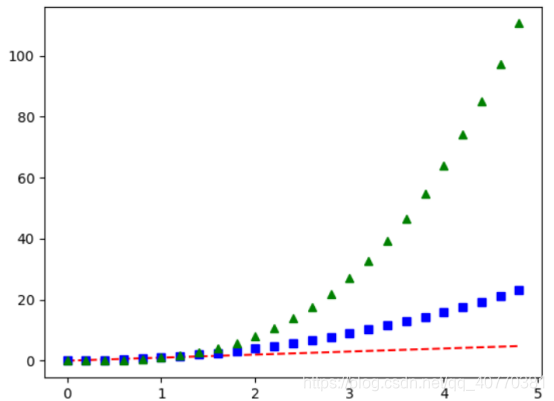
如果matplotlib仅限于使用列表,则对数字处理将毫无用处。通常使用numpy数组。实时上所有的序列都会在内部转化为数组。下面的例子说明了在一个命令中使用数组来绘制多行具有不同样式的线条:
import numpy as np
#以200ms为间隔均匀采样
t = np.arange(0.,5.,0.2)
#红色虚线、蓝色正方形和绿色三角形
plt.plot(t,t,'r--',t,t**2,'bs',t,t**3,'g^')
plt.show()
2.2 用关键的字符串绘图
在某些情况下,我们有某种格式的数据,该格式允许我们使用字符串访问特定变量。如 numpy.recarray 或 pandas.DataFrame 。Matplotlib 允许我们为此类对象提供 data 关键字参数,它可以使用与这些变量相对应的字符串生成图。
In addition to the above described arguments, this function can take a data keyword argument. If such a data argument is given, the following arguments are replaced by data[]:
- All arguments with the following names: ‘c’, ‘color’, ‘edgecolors’, ‘facecolor’, ‘facecolors’, ‘linewidths’, ‘s’, ‘x’, ‘y’.
Objects passed as data must support item access (data[]) and membership test ( in data).
#data是python里一个字典类型的变量
data = {'a': np.arange(50),'c': np.random.randint(0, 50, 50),'d': np.random.randn(50)}
data['b'] = data['a'] + 10 * np.random.randn(50)
data['d'] = np.abs(data['d']) * 100
#绘制散点图,参数c设置点的颜色,参数s设置点的大小,data传参。
plt.scatter('a', 'b', c='c', s='d', data=data)
plt.xlabel('entry a')
plt.ylabel('entry b')
plt.show()

关于散点图的变量信息请参考plt.scatter()
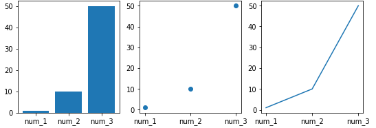
2.3 用明确的变量绘图
matplotlib允许将明确的变量直接传递给许多绘图函数。比如说:
names = ['num_1','num_2','num_3']
values = [1,10,50]
plt.figure(figsize = (9,3))plt.subplot(131)
plt.bar(names, values)
plt.subpolt(132)
plt.scatter(names, values)
plt.subplot(133)
plt.plot(names, values)
plt.subtitle('Categorical Plotting')
plt.show()
2.4控制线段的特性
线段(lines)有许多可以设置的特性:linewidth,dash,style,antialiased(抗锯齿)etc;
具体参见matplotlib.lines.Line2D。这里有一些设置line特性的方法:
-
用关键字:
plt.plot(x, y, linewidth=2.0) -
使用setter方法:
plot返回一个图像的列表,eg:line1, line2 = plot(x1,y1,x2, y2)
在下面的代码中我们假设只有一条线段,然后我们拆解得到的列表,得到其中的第一个元素:
line, = plt.plot(x, y, '-') line.set_antialiased(False) # turn off antialiasing -
使用setp()命令
lines = plt.plot(x1, y1, x2, y2)
# use keyword args
plt.setp(lines, color='r', linewidth=2.0)
# or MATLAB style string value pairs
plt.setp(lines, 'color', 'r', 'linewidth', 2.0)
其他Line2D属性:见matplotlib.lines.Line2D
要获取线的属性列表,用**setp()**以一条或多条线作为参数来调用该函数:
In [69]: lines = plt.plot([1, 2, 3])In [70]: plt.setp(lines)alpha: floatanimated: [True | False]antialiased or aa: [True | False]...snip
2.5 使用多个图形和轴
pyplot具有当前轴的概念。所有绘图命令均适用于当前轴。
函数gca() 返回当前轴,函数gcf() 返回当前figure。通常这些操作都是在后台进行的。
下面是创建两个子图的脚本:
def f(t):return np.exp(-t) * np.cos(2*np.pi*t)t1 = np.arange(0.0, 5.0, 0.1)
t2 = np.arange(0.0, 5.0, 0.02)
#可以发现有两种不同的线合在了一张图中
plt.figure()
plt.subplot(211)
plt.plot(t1, f(t1), 'bo', t2, f(t2), 'k')
#在这张子图只有一条线
plt.subplot(212)
plt.plot(t2, np.cos(2*np.pi*t2), 'r--')
plt.show()
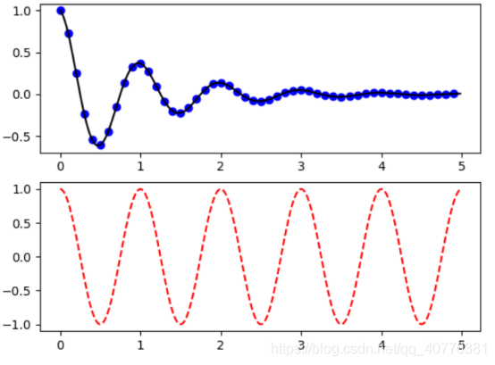
- figure()命令是可选的。因为会默认为figure(1)。
- subplot()命令指定了行数, 列数, 子图数。其中子图数的范围在行数 * 列数之间
下面是创建多个figure()和子图的例子:
import matplotlib.pyplot as plt
plt.figure(1)                # the first figure
plt.subplot(211)             # the first subplot in the first figure
plt.plot([1, 2, 3])
plt.subplot(212)             # the second subplot in the first figure
plt.plot([4, 5, 6])plt.figure(2)                # a second figure
plt.plot([4, 5, 6])          # creates a subplot(111) by defaultplt.figure(1)                # figure 1 current; subplot(212) still current
plt.subplot(211)             # make subplot(211) in figure1 current
plt.title('Easy as 1, 2, 3') # subplot 211 title
可以使用clf() 清除当前figure(),使用cla() 清除当前轴。
如果要制作大量图形,则还需要注意一件事:在使用图形明确关闭图形之前,图形所需的内存不会完全释放直到调用 close() 函数。删除对图形的所有引用,和/或使用窗口管理器关闭图形在屏幕上出现的窗口是不够的,因为pyplot会一直保持内部引用直到close() 被调用。
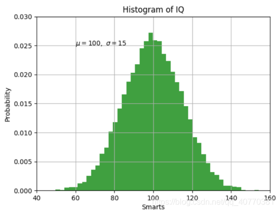
2.6 使用文本
text()命令可以用于在任何位置添加文本。
xlabel(),ylabel() 和 title() 可用于在指示的位置添加文本。
mu, sigma = 100, 15
x = mu + sigma * np.random.randn(10000)# the histogram of the data
n, bins, patches = plt.hist(x, 50, density=1, facecolor='g', alpha=0.75)plt.xlabel('Smarts')
plt.ylabel('Probability')
plt.title('Histogram of IQ')
plt.text(60, .025, r'$\mu=100,\ \sigma=15$')	#Latex格式,$符号包围的内容
plt.axis([40, 160, 0, 0.03])
plt.grid(True)	#设置网格线
plt.show()
在文本中使用数学表达式
matplotlib在任何文本表达式中接受TeX方程表达式。用" $"符号来括起表达式。例如写表达式σi=15:
plt.title(r'$\sigma_i=15$')
具体可参考matplotlib写数学表达式
注释文字
text()上面基本命令的使用将文本放置在轴上的任意位置。文本的常用用法是对绘图的某些功能进行注释, annotate()方法提供了帮助程序功能以简化注释。
在注释中,有两点要考虑:由参数表示的要注释 xy 的位置和text的位置 xytext 。这两个参数都是(x,y)元组。
ax = plt.subplot(111)t = np.arange(0.0, 5.0, 0.01)
s = np.cos(2*np.pi*t)
line, = plt.plot(t, s, lw=2)plt.annotate('local max', xy=(2, 1), xytext=(3, 1.5),arrowprops=dict(facecolor='black', shrink=0.05),)plt.ylim(-2, 2)
plt.show()

2.7 对数轴和其他非线性轴
matplotlib.pyplot不仅支持线性轴刻度,还支持对数和对数刻度。如果数据跨多个数量级,则通常使用此方法。更改轴的比例很容易:
plt.xscale('log')
from matplotlib.ticker import NullFormatter  # useful for `logit` scale# Fixing random state for reproducibility
np.random.seed(19680801)# make up some data in the interval ]0, 1[
y = np.random.normal(loc=0.5, scale=0.4, size=1000)
y = y[(y > 0) & (y < 1)]
y.sort()
x = np.arange(len(y))# plot with various axes scales
plt.figure()# linear
plt.subplot(221)
plt.plot(x, y)
plt.yscale('linear')
plt.title('linear')
plt.grid(True)# log
plt.subplot(222)
plt.plot(x, y)
plt.yscale('log')
plt.title('log')
plt.grid(True)# symmetric log
plt.subplot(223)
plt.plot(x, y - y.mean())
plt.yscale('symlog', linthreshy=0.01)
plt.title('symlog')
plt.grid(True)# logit
plt.subplot(224)
plt.plot(x, y)
plt.yscale('logit')
plt.title('logit')
plt.grid(True)
# 使用以下命令将y轴的次刻度标记格式化为空字符串
# `NullFormatter`,以避免过多的标签使轴变得笨拙。
plt.gca().yaxis.set_minor_formatter(NullFormatter())
# 调整subplot层,让子图之间的间距变宽以容纳数字
# 因为 y轴有 "1 - 10^{-3}"
plt.subplots_adjust(top=0.92, bottom=0.08, left=0.10, right=0.95, hspace=0.25,wspace=0.35)plt.show()
